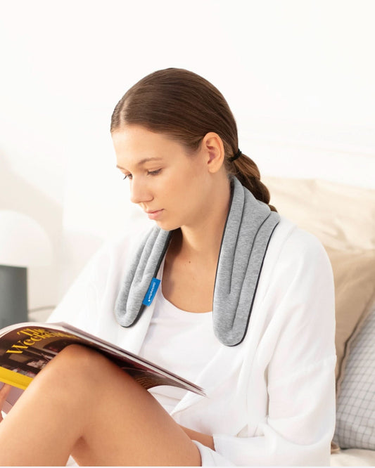
Since we devoted ourselves to enabling contemporary Self-Care, we've been working on products that help build tiny, healthy habits to improve wellbeing. But after talking to our community, we also realized that wellbeing needs were very diverse and that some people were looking for something to help them identify those needs and build their own habits.
We then began to investigate how we could use our experience as designers to create a helpful product: Self-Care Journal.
Background: the benefits of journaling
We found that journaling was an activity with the potential to accomplish what we were looking for. Studies show how reflecting on your day-to-day life and putting it down on paper helps you become more self-aware and discover those that work fine and those that need improvement in your life. Also, it is helpful to have more control over your daily routines. In addition, journaling has other benefits, such as relieving stress or improving sleep.

The challenge
Journaling may seem like a task that doesn't require much: a sheet of paper and a pen may be enough. But we wanted to go further and create a journal that would easily capture the different aspects of life that matter and help keep track of them all. It had to be accessible to people who had never practiced before as well as satisfy heavy users. At the same time, it had to be a high-quality object that offered an enjoyable writing experience to make journaling a pleasant habit.

The solution
A balanced content
To create a smart journaling experience, we found a balance between guided questions that made it easy to keep track of daily habits and open spaces for reflection, optimizing the layout to prioritize content.

We also created the Circle of Self-Care, a visual way to overview different aspects of life and their evolution month by month.

Practical for everyday use
Intended to be used every day for three months (it has no dates, so you can start it whenever you want), we chose the best white soft paper for a fine writing experience.

We also designed it so that it can be opened 180 degrees, thanks to its Premium Smyth-sewn binding. This way, the entire surface area can be used comfortably.
We chose the A5 size because, after several tests, we found it to be the most suitable for the size of the hand. Not only is it easy to hold, but you can also take it anywhere if you need to.

Beautiful for your eyes
Both the exterior and interior design had to be appealing but minimalistic enough so that the most important thing was the content to be written on it. After considering different options, we finally decided to go for a gray hardcover and a white interior, with the typography in Ostrichpillow blue.

For the cover, we created a simple shape but full of meaning: an imperfect circle that simulates a lens, a place to look and reflect on yourself, suspended on a line representing the journey of your life.

The output

Ostrichpillow.
Self-Care matters.


